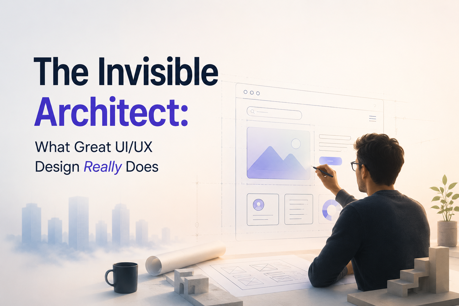
There is a scene that plays out in product teams across the world: a designer presents a sleek, polished interface. The stakeholders nod. The engineers ship it. And then users real users, with real stress and real impatience — arrive, and something breaks. Not the code. The assumption.
UI/UX design is one of the most misunderstood disciplines in technology. To outsiders, it looks like taste. It looks like color palettes and hover animations and the occasional debate about whether a button should be rounded or square. But that surface reading misses almost everything that matters.
The Gap Between Usable and Good
Usability is a floor, not a ceiling. A product can be perfectly functional — every button works, every path leads somewhere — and still fail to serve people well. The distance between "technically usable" and "genuinely good" is where design lives.
Consider the ATM. For decades, the standard cash machine followed a predictable sequence: insert card, enter PIN, select amount, take cash. The interaction was learnable. It became habitual. People stopped noticing it, not because it was elegant, but because repetition made it tolerable. Then mobile banking arrived, collapsed that sequence into two taps, and revealed just how much friction the old model had silently accumulated.
That shift illustrates a foundational truth of the discipline: users don't evaluate interfaces against an objective standard. They evaluate them against how they feel. Confusion, delay, and error don't register as design problems they register as personal failure. "I can't figure this out" is almost always the user's internal reading, not "this was poorly designed." Great UI/UX inverts that dynamic. It makes success feel inevitable.
Hierarchy Is Not Decoration
One of the hardest things to teach a new designer is that visual hierarchy is a persuasion tool, not an aesthetic preference. When an eye moves across a screen, it is not wandering it is being guided. Size, weight, contrast, whitespace, and proximity are all directional cues. They tell the eye what matters first, second, and third. Get it wrong, and the user's attention scatters. Get it right, and they never notice they were being guided at all.
This is why the most effective calls to action are rarely the most elaborately designed. A single confident button, isolated by whitespace, outperforms a dense panel of competing options nearly every time. The principle is ruthless in its simplicity: every element on screen is either helping or hurting the primary task. There is no neutral ground.
Empathy as Method, Not Sentiment
The word "empathy" appears in nearly every design philosophy, which has made it almost meaningless. Used loosely, it becomes a vague invitation to "think about users" advice so broad it produces nothing. Used rigorously, it is a research methodology.
Real empathetic design means sitting with someone who has never seen your product and watching them struggle in silence resisting every instinct to explain, to defend, to hint. It means mapping not just what users do, but what they expect before they act: the mental model they carry into the room. When interface and mental model align, the experience feels intuitive. When they diverge, users call themselves "bad with technology," and your product loses them.
Some of the most valuable insights in modern UX research come not from what users say but from the gap between what they say and what they do. A user might describe an interface as "easy" while unconsciously retracing their steps three times. That gap between reported experience and observed behavior — is where the real design work begins.
The Ethics Embedded in Every Choice
Design is never neutral. Every interface encodes assumptions about who the user is, what they want, and what they should do next. Those assumptions can serve users or exploit them and the line between guidance and manipulation is thinner than most practitioners admit.
Dark patterns design choices that trick users into unwanted subscriptions, obscure cancellation flows, or manufacture urgency where none exists — are the discipline's most corrosive failure mode. They work, in the narrow sense: conversion rates climb, opt-outs fall. But they work by eroding trust, and trust is the only long-term currency a product has. The ethical designer's task is to make the right action easy and the wrong action unnecessary not to make the profitable action inescapable.
Accessibility sits at the same ethical core. Designing for disabled users is not an edge case accommodation it is a fundamental test of whether a design actually serves people or merely serves an imagined average person. Contrast ratios, keyboard navigation, screen reader compatibility, and reduced-motion support are not constraints on creativity. They are the floor of what it means to design for everyone.
What the Next Generation of Design Must Reckon With
The tools are changing fast. Generative AI has entered the design workflow in ways that accelerate ideation, automate layout exploration, and compress the distance between concept and prototype. This is genuinely useful. It is also genuinely dangerous, in a specific way: it makes the production of interfaces dramatically cheaper without making the thinking behind them any clearer.
The bottleneck in design has never been the number of screens a team could produce. It has always been the quality of decisions embedded in those screens. AI can generate a hundred variations of a checkout flow in the time it once took to sketch three. But it cannot decide which one respects the user's attention, serves the company's ethics, and solves the actual problem being faced. That judgment remains irreducibly human and more valuable than ever precisely because the surface-level output has become so easy to generate.
The most important skill in UI/UX design has always been the same: the ability to hold the user's experience in mind so clearly that bad decisions feel wrong before they ship. Everything else, the tools, the frameworks, the trend cycles is in service of that capacity. Develop it, and the rest follows. Lose it, and no amount of sophisticated tooling will save you.
The invisible architect leaves no signature. The work succeeds when no one thinks about the design at all, only about what they were able to accomplish. That quiet disappearance is the highest form of the craft.
